
What is the Modern SharePoint Experience?
With Microsoft’s introduction of the Modern experience in SharePoint, it can sometimes be difficult for users to distinguish between this new and more useful Modern interface and the original Classic experience. Fortunately, this article will provide a quick overview of the Modern SharePoint experience in order to give most users reason enough to move away from the Classic experience and start enjoying the many benefits of the Modern experience.
The Classic SharePoint Experience
It is easier to grasp the Modern SharePoint Experience after understanding what makes up the Classic SharePoint Experience.
The Classic SharePoint Experience is, in many ways, an attempt to allow users to create a web-like intranet site without having to take away one of the company’s professional web developers from their external facing responsibilities. However, in order to make that happen, Classic SharePoint requires a master design to ensure that later updates and customizations will not require those same website professionals. The Classic experience is a hierarchy of pages and links that too often takes too many people and too many meetings to create. Once in place, the structure can be difficult to modify for specific uses or situations.
For many enterprises, the ability of someone like the local Human Resources event coordinator to create, update, and produce an internal site as a resource quickly hits a bottleneck because HR experts are not intranet experts. Creating tickets, holding meetings, and getting information updated often took so long that departments gave up posting current, dynamic information. Left behind is yet another internal website filled with nothing but static links to other resources. Instead, the event coordinator just emails everyone pictures of the latest staff picnic.
What Is The Modern SharePoint Experience?
The Modern SharePoint Experience takes many of the Classic SharePoint Experience bottlenecks and eliminates them by providing interface-based options and easier permissions. For example, while the Classic SharePoint Experience offered templates, or branding pages, altering them required setting up complicated master pages or creating CSS configuration changes, both of which were too much for department-level users.
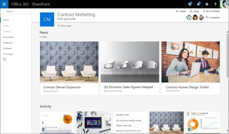
Likewise, the original Team Site template was designed around the idea of propagating current events to members of a team. As such, the default elements were Calendar, Announcements, and then Links. On the Modern Experience, there is now a News element that takes the place and expands on Announcements. This ensures that SharePoint still is a quick-look informational hub.
However, additional elements like the Quick Links section for frequently used links put more information front and center. Documents can now be added as links instead of as copies so that everyone gets the same document regardless of where they click on it. An additional Site Activity section provides real-time updates about what has changed within SharePoint itself. All of these elements can be rearranged or even pinned at the top to ensure users get what they need right away.
Communication Sites
Beyond the Team Sites, Modern Experience moves from the classic publishing site to the Communication site. These sites are designed for a smaller group, like a part of a team or working group, to distribute information to a larger group. Unlike the classic publishing site, the modern Communication site doesn’t rely on a previously designed and activated master page. Instead, there are easy-to-use templates available to ensure that those without any programming or web development skills can create and update a communication site. Communication sites use modern pages and web parts rather than pre-implemented features derived from the master page.
Modern experience Communications sites come with three different templates. The Topic template creates a news-like blog site with places to publish news, events, content, and documents. Various elements are prepopulated on the page. Each element is customized with titles, contents, and links. Unneeded elements are deleted, or new elements are added. With each addition or deletion, the page reconfigures itself to maintain a usable look and feel.
The Showcase template is designed to provide a place to publish photos, videos, and images. Like the Topic template, the Showcase template is pre-populated with places for images and pictures in a thoughtful layout that adjusts according to screen size. The Showcase template is particularly useful for anyone to post pictures and content from company events or get-togethers without having to spend hours getting it laid out and approved.
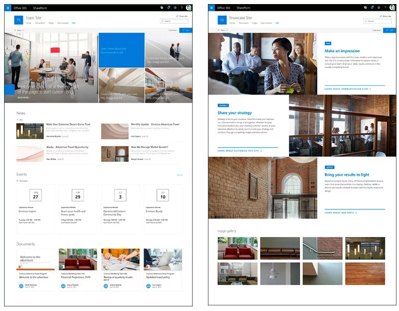
Finally, the Blank design allows for a free-form page design by placing web parts anywhere on the page. While the template does not come with blank fields, the user simply adds them in the order and layout they desire. All three templates are mobile-ready to ensure that both remote users and users on the go get the same access without having to pinch and zoom every detail.
Hub Sites
To put it all together, the Modern SharePoint experience offers Hub sites. Hub sites are typically built from a communication site template and serve to link and organize the other team and communication sites, as well as serve as a common starting place. Hub sites are also a good place to start organizational branding to carry into the other site models.
An organization can create up to 2,000 Hub sites. However, individual sites can only be associated with one hub. The main usage of a Hub site is to provide either association or navigation to other sites in the modern experience. Sites associated with a Hub site can roll content up to the Hub site, surfacing important content from individual sites to a larger group of users. For navigation purposes, Hub sites offer a place to collect and display links to data and other Team or Communication Sites that might otherwise go unnoticed or that are difficult to find.
Modern Web Parts
The key pieces of the Modern Experience page layouts are web parts. Web parts are simply contained SharePoint elements. The user defines fields of information, and SharePoint does the rest. In other platforms, web parts are sometimes known as widgets.
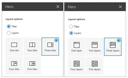
One of the most flashy web parts is the Hero web part. The Hero web part takes a combination of text, links, and pictures and groups them together in a way that is visually interesting. Like other web parts, any potential complexity is reduced to simply typing data into blank fields and making limited option choices.
For example, you can choose for your Hero web part to be tiles or layers. Then, within that choice, you can choose how many tiles or layers. For each tile or layer, the user clicks and fills in what text, picture, title, or link goes in that layer. By following through to completion, the user creates a nice-looking, well-spaced, size-adjustable, mobile-ready site… all without a single line of code.
Easier To Use, Easier to Share
Using the Modern SharePoint Experience is also easier. The new modern search experience automatically customizes and adjusts itself based on what users did previously. A user that continually interacts with spreadsheets from accounting will find those results above other documents from different departments.
Another advantage of the Modern SharePoint Experience is the ability to use Office 365 group permissions. Unlike Active Directory (AD) group permissions, which are typically managed by IT, Office 365 group permissions allow for the ongoing, dynamic granting and removing of lower-level permissions within a SharePoint site or Team page.
With the Modern Experience, even a single user can be granted access to a site without being added to a group. Adding people to the group or a SharePoint resource can be done from the Site Permissions inside the settings of SharePoint itself. Also, Office 365 groups enable the site to use Teams, Planner, and Outlook within SharePoint.
Ready to Modernize Your SharePoint Experience?
While the SharePoint Modern Experience offers an easier-to-use, easier-to-build experience today, Microsoft continues to add functionality in the form of additional templates, lists, and web parts. Companies using the SharePoint Modern Experience today are well-positioned to communicate quickly and efficiently, now and in the future.
If you’re ready to modernize your SharePoint experience, Imaginet is here to help. Our Imaginet-certified SharePoint experts have helped over 500 customers around the globe with all of their SharePoint needs since the first version of SharePoint was released. And we’re ready to help you, too.
To find out more, schedule your free consultation call with Imaginet today.
Thank you for reading this post! If you enjoyed it, I encourage you to check out some of our other content on this blog. We have a range of articles on various topics that I think you’ll find interesting. Don’t forget to subscribe to our newsletter to stay updated with all of the latest information on Imaginet’s recent successful projects

discover more
SQL Saturday Part 2: Learning About Microsoft Fabric
SQL Saturday Part 2: Learning About Microsoft Fabric February 29, 2024 I’ve been digging into Microsoft Fabric recently – well overdue, since it was first released about a year ago.…
My Trip to SQL Saturday Atlanta (BI Edition): Part 1
My Trip to SQL Saturday Atlanta (BI Edition): Part 1 February 23, 2024 Recently, I had the opportunity to attend SQL Saturday Atlanta (BI edition), a free annual event for…
Enabling BitLocker Encryption with Microsoft Intune
Enabling BitLocker Encryption with Microsoft Intune February 15, 2024 In today’s data-driven world, safeguarding sensitive information is paramount, especially with the increase in remote work following the pandemic and the…
Let’s build something amazing together
From concept to handoff, we’d love to learn more about what you are working on.
Send us a message below or call us at 1-800-989-6022.


